When Bright Feels Too Loud
Summer decor often leans toward bold—tropical prints, saturated blues, high-contrast whites. But not every home thrives on that level of energy. For many, summer is not about spectacle, but stillness. It’s about lightness, breathability, and softness—in both color and emotion.
This is where soft color palettes come in. They offer a gentler approach to seasonal styling, using tones that refresh rather than overwhelm. And surprisingly, there’s science behind why this matters—especially during warmer months when our nervous systems are already stimulated by heat, light, and social activity.
What Are Soft Summer Palettes?
Soft summer palettes are typically made up of muted, pastel, or low-saturation colors that mirror the natural fading of light at dawn or dusk.
Common colors include:
-
Warm white
-
Pale sage or olive
-
Dusty rose
-
Butter yellow
-
Sky blue
-
Faded terracotta
-
Soft citrus tones (like lemon or peach)
What these shades have in common is visual rest. They allow the eye to wander without tension and the mind to settle into ease.
Why Color Affects Mood (and Sleep)
Color isn’t just aesthetic—it’s neurological. According to researchers at the University of Sussex, color has a measurable impact on our autonomic nervous system, influencing things like heart rate, energy levels, and even temperature perception (source).
-
Bright red tones stimulate alertness
-
Cool blues and greens lower anxiety
-
Soft yellows encourage warmth and optimism
-
Pale neutrals increase feelings of clarity and cleanliness
In the summer, when our environments are brighter and busier, these soft hues act like a balm—encouraging rest without making a space feel cold.
The Role of Light in Color Perception
Natural light intensifies color. A shade that feels soft in winter may feel bold when hit by high-summer sun. That’s why decor that uses soft colors on a white or neutral base works especially well in July and August. It allows the light to interact with the space without becoming overstimulating.
Designers often recommend fabrics and accents that reflect light gently, like:
-
Cotton or linen duvet covers
-
Pale wood tones
-
Sheer curtains
-
Matte, non-glossy ceramics
These textures diffuse the light, rather than bouncing it back harshly—supporting the emotional intention of a soft palette.
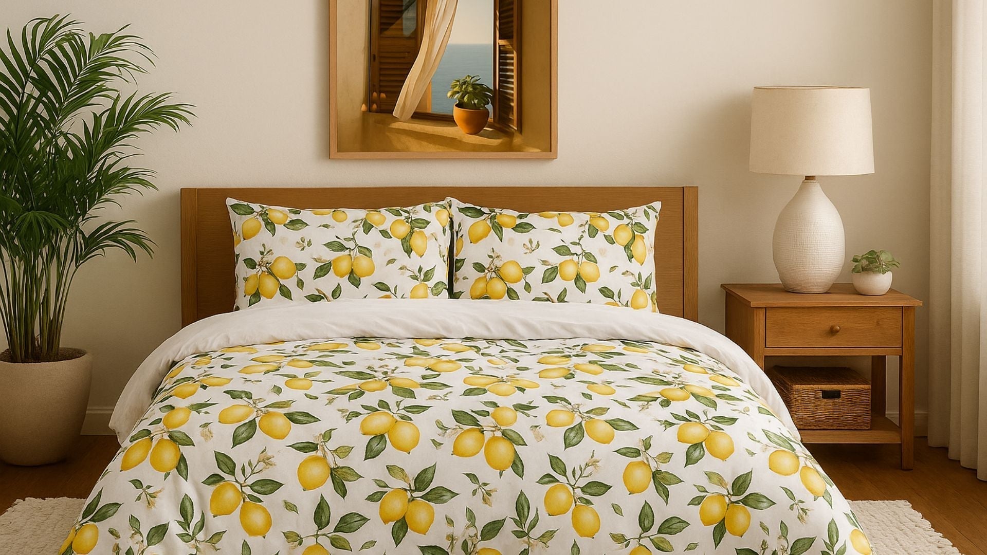
Featured Look: A Hint of Citrus
One way to bring soft color into your summer decor without sacrificing joy is to introduce cheerful, low-saturation prints—like the kind found in our Lemony Zest Duvet Cover.
This pattern balances airy white space with sun-warmed yellows and soft, natural greens. It doesn’t compete with the light—it enhances it. The lemon motif adds freshness and whimsy without loud contrast, making it perfect for bedrooms or guest spaces in the warmer months.
Whether you're refreshing your bedding or layering in a light summer throw, citrus tones are a beautiful way to infuse calm energy into your space.
How to Use Soft Palettes in Your Summer Home
1. Start with White or Cream as a Base
Let your walls, bedding, or curtains hold the neutral space. These colors create room for softness to shine.
2. Add One Accent Tone
Choose a single muted color to build around. For example:
-
Dusty sage in a pillow
-
Pale gold in a throw
-
Lavender in a candle label or print
Let this tone repeat in 2–3 areas for cohesion.
3. Blend in a Subtle Print
If you’re using florals, fruit, or garden-inspired patterns, make sure the background is light and the colors stay within the same saturation range. Think linen softness, not poster brightness.
4. Limit Sharp Contrasts
Avoid pairing soft palettes with harsh black or overly saturated accents. Instead, layer in natural textures like wood, rattan, or soft clay.
5. Let Light Guide the Mood
Notice how your space changes from morning to evening. A soft palette will adapt throughout the day, offering coolness during heat and warmth during sunset.
Frequently Asked Questions
What is the best soft color for summer bedrooms?
Pale yellows, soft sage, and light blue are excellent for bedrooms. They reflect light gently and create a calming environment that still feels seasonal.
Can soft colors still feel cheerful?
Absolutely. It’s all about tone and balance. A lemon or peach shade can be joyful and bright without being jarring. The key is using plenty of white space and grounding it with soft green or neutral accents.
How do I keep soft palettes from feeling too plain?
Layer in texture. Woven blankets, fringed pillows, ceramic vases, and watercolor-style wall art can all add depth without boldness.
Is soft color good for small spaces?
Yes. Muted tones and white-based prints help open up small rooms by making them feel brighter and less cluttered. Avoid using multiple dark tones or heavy contrast.
Warmly,
The Cozy Corner by Durazza
Blankets | Candles | Puzzles | Journals | Pillows | Duvet Covers | Wall Art