Mixing Summer Neutrals with Fall Layers
A breeze lifts the curtain just slightly. Outside, the sun hangs low—still golden, but quieter now. There’s a softness to this part of the season, a kind of hush between heat and harvest. Indoors, the light filters through in amber tones, brushing against the edge of a well-loved throw pillow and the folded blanket at the foot of the bed. Everything feels paused, ready to shift.
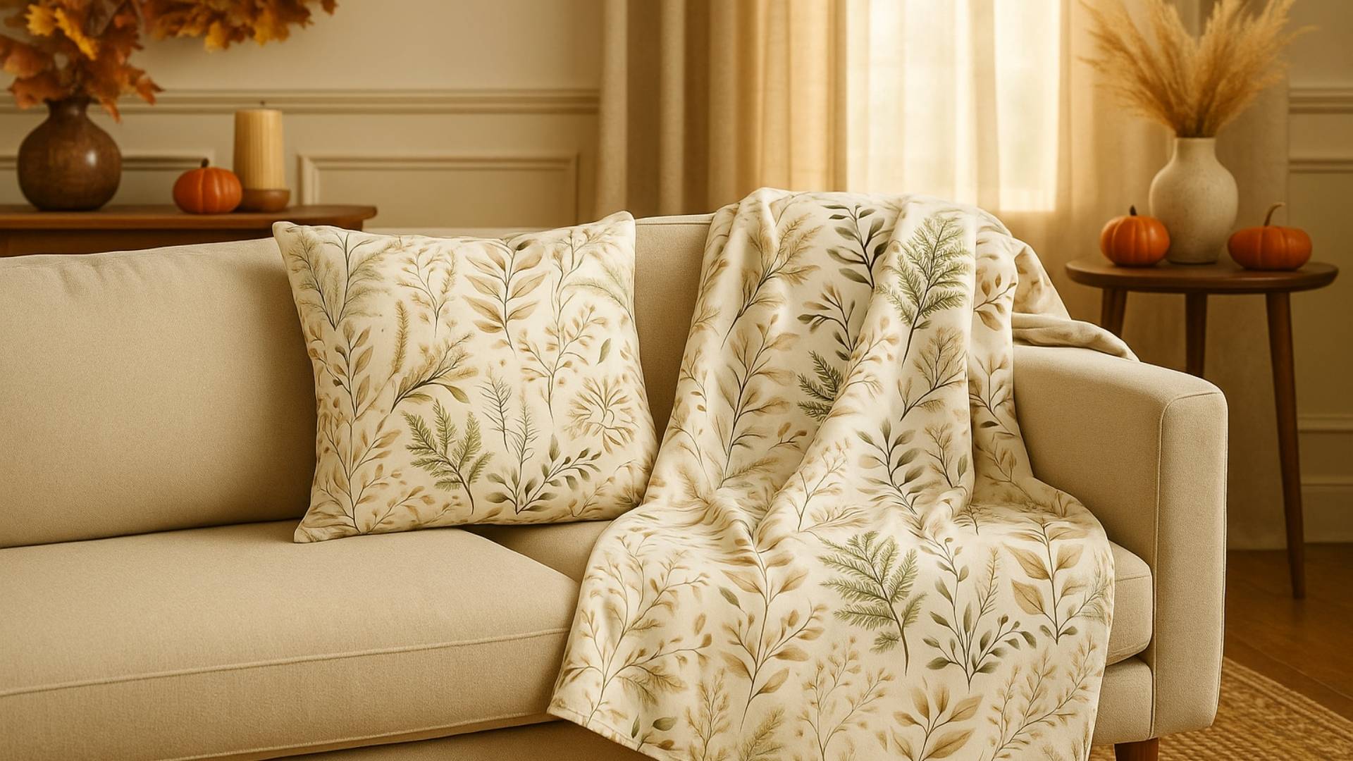
This is where the Fernlight pieces belong. A botanical pillow resting against your reading chair, and a throw blanket in soft earth tones draped where the late-summer light lands just right. Neither fully summer nor yet autumn, these textures help create a room that holds space for both.
Begin with Botanicals
Nature doesn’t rush the seasons, and neither should we. Decorating with organic patterns like ferns and delicate leaves adds quiet movement to a space without overpowering it. These kinds of designs ground a room in nature’s own pace.
The Fernlight Pillow, with its soft sage and sand-toned print, is an easy addition to an existing summer palette. Its presence evokes something wild yet controlled—like the last few lush green moments before the leaves begin to change.
Pair it with neutral fabrics, aged woods, or natural elements like clay and woven textures. Let the print breathe, and avoid competing patterns. The goal isn’t transformation, but soft evolution.
Layer with Intention
Late summer into early fall is the season of subtle layering. Think of your home as a wardrobe—add warmth without abandoning the lightness of July. Draping the Fernlight Blanket over the edge of a bed or couch brings visual weight in a soft, comforting way.
Its tones are subdued, but its texture says, “it’s okay to slow down now.” Unlike heavier fall motifs or deep autumn colors, Fernlight straddles the seasonal edge gracefully. It doesn’t demand attention. It simply invites calm.
Blend Neutrals, Don’t Replace Them
When moving between seasons, resist the urge to swap everything out. Instead, deepen what already exists. Add earthy neutrals like flax, mushroom, olive, or honey to your space through candles, artwork, or textiles. These tones catch both the remaining light of summer and the shadowed edges of fall.
The Fernlight pieces work beautifully alongside white linen, ivory walls, or tan woven baskets. Their print offers just enough depth to anchor a space, without tipping it too far into seasonal extremes.
Let Mood Guide Placement
Design psychology shows that soft textures and nature motifs reduce stress and promote emotional grounding. In transitional months—especially for those who feel the pressure of back-to-school or busy schedules—your home should be the counterweight.
Place your Fernlight Pillow where you read or unwind. Layer the Fernlight Blanket on the end of a shared couch. Use them not as decor, but as visual reminders that comfort is allowed.
You’re not decorating a room. You’re creating a pause.
Candlelight and Seasonal Rituals
This time of year invites slowness. Whether it’s lighting a candle after dinner or adding one cozy thing to your space each week, those rituals matter.
While Fernlight may be the visual piece, what surrounds it completes the mood: a lavender candle for balance, a mug resting nearby, an open book that doesn’t need to be finished tonight.
It’s not about starting fall. It’s about letting summer take its time.
Frequently Asked Questions About Neutral Fall Home Styling
How do I style neutral tones without making a space feel flat?
Use texture and pattern to create depth. Mix soft textiles like sherpa or velvet with visual interest like ferns, florals, or aged wood. Balance is key.
When should I begin adding fall layers to my home?
Late August is ideal. Start with lightweight items like throw blankets or pillows that still feel breathable but hint at warmth.
Can I mix botanical prints with other decor?
Absolutely. Keep other elements minimal. Think single-toned ceramics, soft lighting, and one or two statement prints like Fernlight.
Is it okay to still use light colors in fall styling?
Yes—especially in early fall. Pale olive, ivory, muted gold, and soft taupe transition beautifully into the cooler months.